Hara Kenya
1
The "Haptic" Exhibition intentionally features the activity of making things, that is, the activity that originates in the human senses, not that stimulated by new materials. The term "haptic" means to be palpable to the sense of touch. What kind of design arises when we establish as our primal concern in making things a focus on tactile perception? We enjoyed the participation of 21 professionals: architects, designers of every field, a plasterer, and the designers at one household appliance manufacturer, who undertook the design of commonplace objects by delving into their haptic element. These professionals have turned out original, vital products like hair lanterns, a soft doorknob, fruit juice packages made of fake fruit skin, and coasters like frogs' eggs. Please fully enjoy the world that has evolved here, driven by the senses, not propelled by technology.
CABBAGE BOWLS, 2004
2
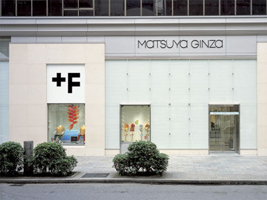
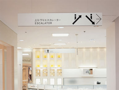
For a renewal of the established Matsuya Department Store located in Ginza, Tokyo's essential and traditional entertainment district, we proposed replacing the corporate color blue with white, in order to demonstrate their respectable background and comprehensive nature as well as modernity and dignity. Because we envision the department store as distinct from a virtual retail space, in which we directly experience shopping by setting foot in the store, another important touchstone of our design proposal is the valuing of the texture or feel of materials, which yields a wealth of stimulation to the visitor's sense of touch. One of our operational examples is the dot pattern used for the walls on the front of the building, for shopping bags, and for cards. The posters for the opening announcement are also designed to impress the audience with a tactile presence by using embroidery and zippers.
3
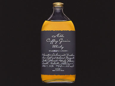
This series of projects for the Nikka Whiskey Distilling Co. is an attempt to include in modern mass-produced objects the charm or magical element of strong spirits. There are only a few internationally accredited wineries in Japan. The Grace Wine Chuo Budoshu in Yamanashi Prefecture is one of them. On the label is an extremely clear wine description design in Japanese. The flavor of Iwafune rice, grown in Niigata Prefecture, rivals that of Minami Uwonuma rice, which ranks among the best in Japan. The Iwafune brand symbolizes the spirituality of the Japanese culture.
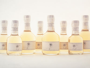
The "Tampopo [dandelion] sake" is specialty produced in the village of Tsurukawa-cho, in Japan's northern island of Hokkaido, where the largest number of dandelions in Japan is found. On the label is an etching of the plumed seeds of dandelion down, whose count grows by one every year. In 2004 there will be six seeds on the label.
The design of the bottle for "Hakkin Sake," produced by Masuichi Ichimura Shuzojyo distillery in Obuse-do, Nagano Prefecture, seems to be a mirror, which disappears into its environment.
4
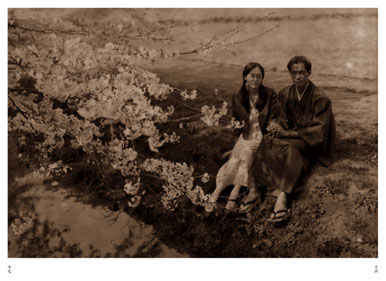
Rather than using the conventional image of a cherry blossom flower, JT SAKURA employs simple designs to capture the essential image of cherry blossom that people have in their own minds. The colouring, which gives the flowers a misty, distant effect, comes from a piece of paper used in a Heian Period (794-1185) artwork called "Tsugishikishi" by the calligrapher Onono Tofu (also known as Onono Michikaze). Inside "Tsugishikishi" is a blank page, and we have used this as the colour of the package. To seal it, we used a thin paper seal on one side. The paper is decorated with a unique representation of "yaezakura" (mountain cherry). When you open the catalog, this semi-transparent inner sheet decorated with tie-dyed cherry blossoms is the first page you see. The catalog is an SP tool used when JT Sakura was first launched; at that time it was a fictional piece of work which illustrated the pleasure of smoking tobacco, as enjoyed by literary personalities at the start of the Showa Period (1926-1989).
5
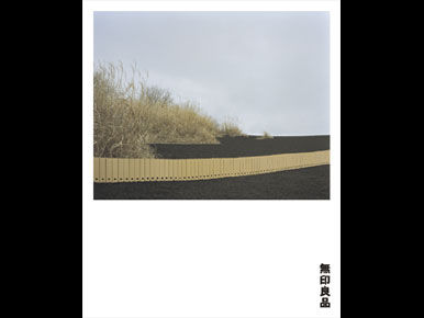
MUJI's very simple products have resulted in the omission of all useless design. There evolves a new vision of MUJI's two-decade history, in which omission is not synonymous with "no design" but with an ultimate design aiming to perpetually approach perfection. The advertising launched in 2003 manifests this vision, but was designed to function not as a messenger but as a vessel, receptive to the wide variety of customer's opinions or suggestions for MUJI. Our first such "recipient" visual was "Horizon", images from the Salt Lake at Uyuni, Bolivia and the prairies of Mongolia. In order to introduce its products to the world market, MUJI participated in the Milan Salone. The Hara Design Institute designed the visuals and created the concept book for this project.





/http%3A%2F%2Fstorage.canalblog.com%2F96%2F81%2F680409%2F48951564_o.jpg)
/http%3A%2F%2Fstorage.canalblog.com%2F70%2F15%2F680409%2F80888084_o.jpg)
/https%3A%2F%2Fstorage.canalblog.com%2F73%2F21%2F680409%2F80893517_o.jpg)
/https%3A%2F%2Fstorage.canalblog.com%2F63%2F09%2F680409%2F80891626_o.jpg)
/https%3A%2F%2Fprofilepics.canalblog.com%2Fprofilepics%2F5%2F8%2F585329.jpg)
/https%3A%2F%2Fassets.over-blog.com%2Ft%2Fcedistic%2Fcamera.png)